Thornton Heath Library
Facing a weekend with nothing to do for the first time in ages, yesterday I set off to see the newly refurbished Thornton Heath Library by FAT Architects (or, more formally: Fashion Architecture Taste). It was also a good excuse to venture south of the Thames, something I don’t often do. Thornton Heath is close to Croydon’s town centre, accessible by rail after a long Tube journey from where I live in Northwest London.
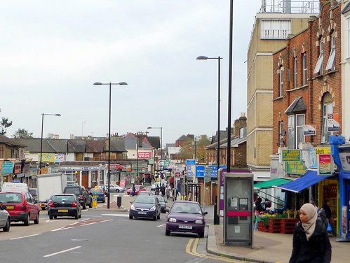
Like many parts of outer London, Thornton Heath has a scrubby (yet bustling) high street that tapers off into nondescript semi-detached housing as one walks away from the station. The library is located in the fringe area where commercial has tapered to residential, yet is positioned so that FAT’s cast-concrete supergraphics are visible through the forest of shop fronts on the high street (see photo above).
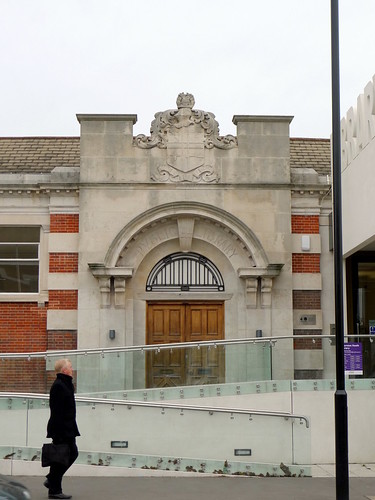
The original building was constructed as a Carnegie Library in 1914. Like most of these libraries, it was built with a formal front entrance and raised off the ground by a flight of stairs. FAT’s design reorients the building around a new glass-enclosed entrance pavilion with a highly visible public reading room inside. The accessibility of the entrance is made into a design statement, as the new wheelchair ramp intentionally cuts off the original entrance which now sits behind it and is stranded above ground level (cue up a Colin Rowe-inspired discussion of phenomenal versus literal transparency here). If I had one criticism of this part of the building, the glass balustrade combined with white concrete makes all of the leaves and rubbish trapped between them incredibly visible from the street.
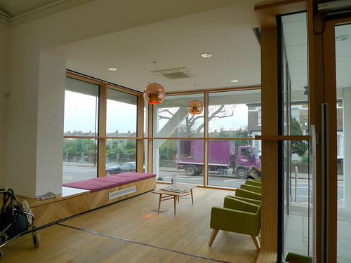
The extension of the reading room allows the interior of the building to feel much more spacious that it must have in its previous incarnation. People were actively using this area, taking advantage of the comfortable and well-selected furniture to enjoy a newspaper and watch the world go by. The windows themselves are huge and divided by wood mullions that are sympathetic to the oak furniture and hardwood flooring. They are much nicer than what it typically installed on public design-build projects.
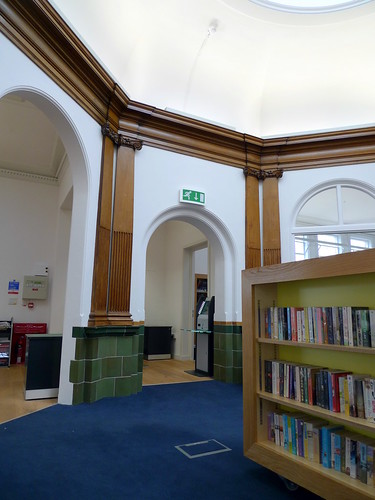
While the original entrance has been permanently sealed, the interior finishes and skylight have been restored to their original glory over what was originally the entrance lobby and is now a reading and browsing area. The incorporation of the original detail within the context of a vastly improved plan and circulation strategy shows the value of a carefully-considered renovation over a new-built library.
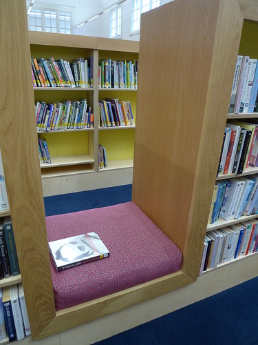
Aside from the well-chosen stand alone furniture, the furniture integrated into the shelves in the library stacks was a fantastic touch and very much in-tune with the way people look for books. I’m surprised this sort of arrangement is not more common, because it is ideal for browsing.
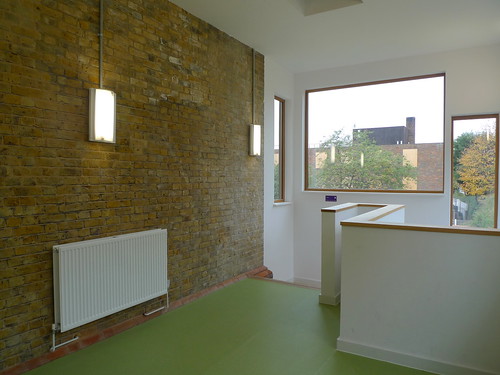
The children’s library and public meeting room are both located on the lower level, accessible by a delightful light-filled stair that hugs the original exterior wall. The children’s reading room opens on to a deck with a grassy yard beyond. Rather than simply denoting the space for children with primary colours and a ‘fun’ carpet, the room is well-proportioned and the access to the outdoors makes it a special space separate from the rest of the library. It was incredibly well-used on the day of my visit. I did not photograph the children’s library because, being an adult man with no child in tow I was certain it would raise some sort of alarm.
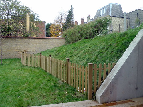
The one strange thing about the rear of the building was an American suburban-style picket fence that I can only guess was a Health & Safety inspired addition to keep kids from climbing the lush and inviting hill beyond:
Many older public buildings do not meet modern needs, but the sort of careful (yet not timid) approach shown by FAT both reinforces both the importance of building re-use and of the necessity for the involvement of talented architects in making great public buildings. Education Secretary Michael Gove’s attacks on architects for creaming off ‘huge’ fees on school design and refurbishment projects seems particularly off-target when one encounters a public building such as this that has benefited immensely from good design.
The Museum of Croydon
The Museum of Croydon is tucked away inside the Croydon Clocktower, a Grade I listed building built in the 1890s and designed by Charles Henman Jun. It holds a variety of cultural amenities and is adjacent to the Croydon Town Hall.
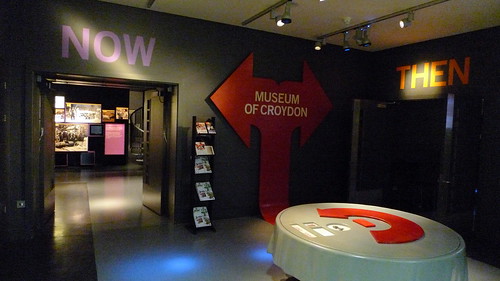
The museum tells the story of Croydon as told through objects. It doesn’t have many timelines, pictures or detailed maps (aside from one introductory display on land ownership and key roads) but instead is organised into rooms by era with corresponding items from the collection. FAT humorously labelled the entrance ‘then’ and ‘now’ which implies (unlike many museum displays) that there is no correct order in which you should view the displays.
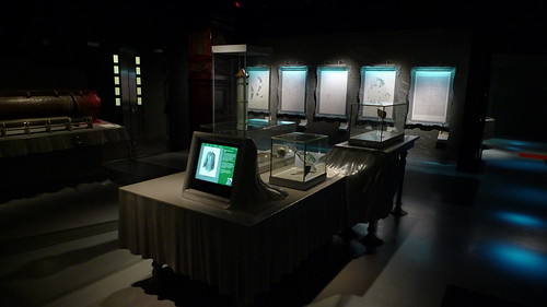
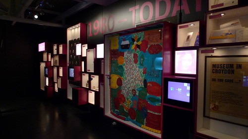
The interior of the museum is very dark, which is accentuated by the grey matte plastic surfaces that mimic a variety of other materials like gilded picture frames or fabric. The objects are typically displayed in single item clear enclosures with a small and very difficult to read tag on each item. The descriptions border on cryptic in many cases. There is also a touch-screen display that accompanies each small group of objects, but the information on the computer mimics the minimal content of the wall tags.
The displays are well-designed, and as an ensemble the interior of the museum is gorgeous to look at. Unfortunately, I don’t feel like I learned much about Croydon from my visit. While there was some information about the Blitz, it was very general and didn’t go beyond the information you could learn about many other British cities during World War II. Similarly, the Commodore computer from the Croydon library looks remarkably like every other Commodore computer sold around the world during the same era. While I conceptually get the point about telling the story of a place through objects, I think its unfortunate that so little of the story of the place is really told here. Croydon’s high-rise skyline makes it a peculiar place and I’d like to know more about why it turned out that way.
The collection of the museum is not a shortcoming on the part of the architects, I think the Museum staff should have considered more effective ways to tell the story of the city through these objects. The abundance of computer technology within the exhibition spaces could allow for a much richer experience if more information was provided.
Additional photos for both the library and museum can be found on my Flickr stream.
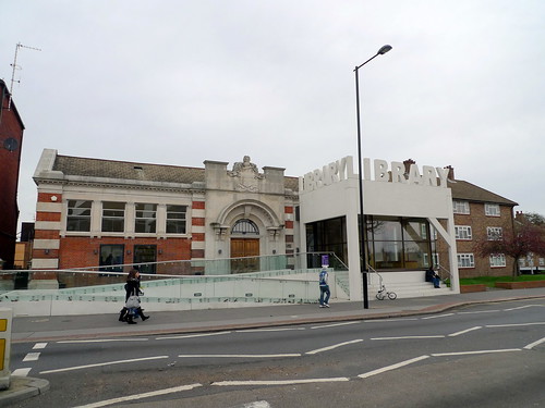
Frontage of Thornton Heath Library.
This frontage is an absolute disgrace, a waste of tax-payers money, was it designed by a twelve year old?
Regards Allan Miah
Everyone is entitled to their own opinion, obviously, but I think its fantastic. Even if you don’t like the appearance of the front, the building works very well and appears to be heavily-used so I don’t think you could consider upgrading it a waste of money.