The Art Gallery of Ontario (AGO) completed an extensive renovation in 2008 that transformed its building on Dundas Street in Toronto. Work began in 2004 and cost $276 million. Led by Frank Gahry, Instead of starting afresh, Gehry took the existing building and its somewhat chaotic slew of previous expansions and unified it into a functioning whole. The expansion was a controversial strategy, with many people concerned that a large amount of money was being spent without obtaining a signature Gehry building.
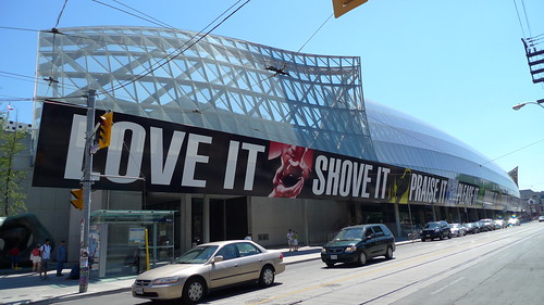
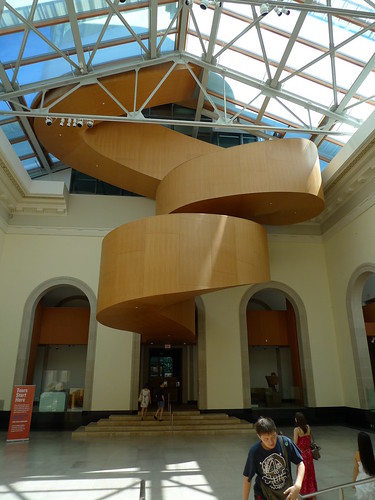
Upon entering the building under an expressive glass-clad cantilevered upper gallery (see above) one enters a low ticket hall. Passing through this area and into the Walker Court at the heart of the building, this well-lit atrium space shows one of Gehry’s most dramatic interventions in the old fabric of the building:
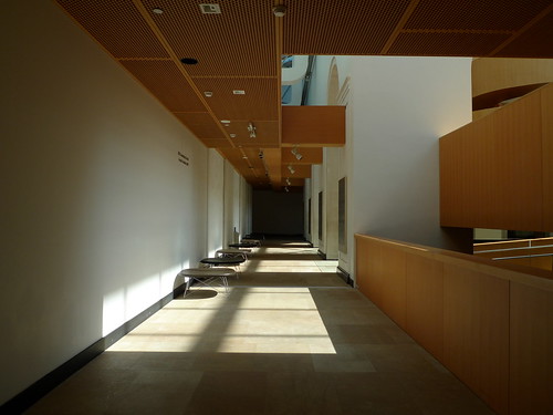
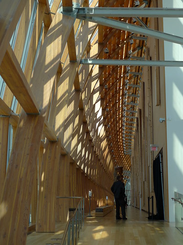
In order to reach the stair, shown above, visitors must walk upstairs to the upper level of the atrium and walk around the perimeter. The new portion of the construction is finished in light-coloured wood and touches the existing early 20th Century building very lightly:
The insertion and interaction of the new within and attached to the old looks strange when compared to most of Gehry’s recent highly sculptural work, but when looked at in relation to his work from the late 1970s through mid 1980s it clearly references an important part of his tradition.

His own home in Santa Monica is the best example from this period. By taking a “Dutch Colonial” home in a typical Santa Monica neighbourhood and  building an armature around it, while also strategically removing portions of the old house, Gehry deconstructed the experience of home life itself (see a collection of photos and drawings on Arch Daily here). He also collaged together many of the building blocks of suburbia in an unexpected juxtaposition- one that disturbed his neighbours. They obviously had no problem with corrugated metal or chain link fences (they were common on other homes in the area) until Gehry decided to get creative with them.
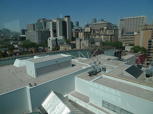
Moving up further into the AGO via the curved stair shown earlier,visitors move through the exposed structure (most original steel) of the atrium and then through the roof, where the outside of the stair has a glazed strip that runs at eye level.The views open up when you get above the original atrium, giving you a view of the jumble of parts that make up the building.
At the top of the stair, the modern/contemporary galleries are spread over two floors with high ceilings and glass walls to the north and south. The south wall is protected from the sun by exterior shading that appears to be operable.
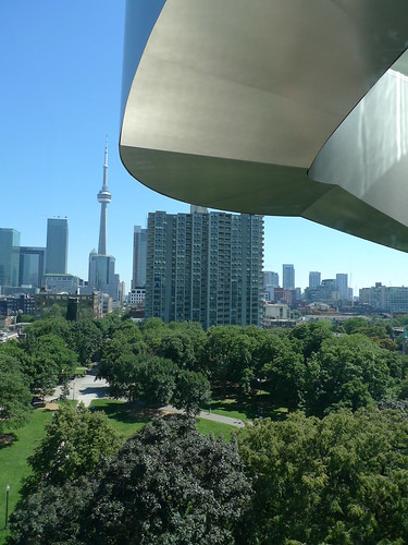
Moving back down the building requires you to go down a similar stair to the one on the north, except the view is better here as you descend into a park with the CN Tower in the background:
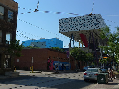
There are also views of Will Alsop’s building for the Ontario College of Art and Design next door:
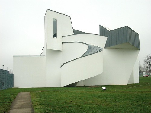
The stairs, clad in grey metal, do reference the Bilbao/Disney Concert Hall side of Frank Gehry. They also go back a bit further in his career, specifically his Vitra Design Museum of 1990 in Germany. The Vitra project was not conceived entirely as a sculptural object, as I would argue works like Bilbao are, but was designed equally as an experience. The Vitra is also formally similar, one only has to look at the enclosed twisting stair to see the lineage:
The other impressive interior spaces in the refurbished AGO is the Galleria Ilalia. It cantilevers over the sidewalk on the front of the building and it is attached to the old front wall of the museum. Unlike other Gehry buildings I have been to, it is very well-detailed and well-proportioned.
The weakest part of the building is its unfortunate exterior on the south side. Hovering over the adjacent park and facing downtown, the façade is a particularly obnoxious shade of blue metal that looks more like a roadside office park from the 1980s than an urban museum. The sight of the AGO next to Alsop’s OCAD building reads like an obnoxious “battle of the starchitects”:
It’s a shame they succumbed to the use of coloured titanium on the exterior of the building, which reminds me of Gehry’s equally obnoxious Experience Music Project in Seattle. That aside, I think it is a fantastic building and a sensitive and sensible re-use of an existing asset. I would like to see more renovation projects from Gehry’s office- they rose to the challenge in Toronto in a way that is far more nuanced and effective than on many new-build projects.

Thanks for the thoughtful review!