Donnybrook Quarter is a recent award-winning low-rise scheme in Bow, London (map) by Peter Barber Architects, seen by many as as the antidote to the modernist tower and built as mixed-tenure housing for a social landlord. Robin Hood Gardens is a well-known and oft-disparaged brutalist structure from the 1970s by Alison & Peter Smithson, stretched out over a huge site in two imposing concrete blocks. While the proposed demolition of Robin Hood Gardens has set off a controversy that became more about ideology that the merits of the building itself, how does it compare to a Stirling Prize shortlisted housing scheme of the past five years? I visited both East London sites this past weekend and took a look around.


While Donnybrook Quarter is often called “high density” (one example is in this award statement from the AIA) it’s interesting to note that Robin Hood Gardens is facing demolition for not being dense enough (compared to the proposed redevelopment), yet both projects have a very similar unit count per acre: 45 units per acre at Donnybrook (published figure) and approximately 50 units per acre at RHG (calculated density). The first thing one notices upon entering the Donnybrook Quarter site is its density, it may be low-rise but it definitely feels tightly packed:
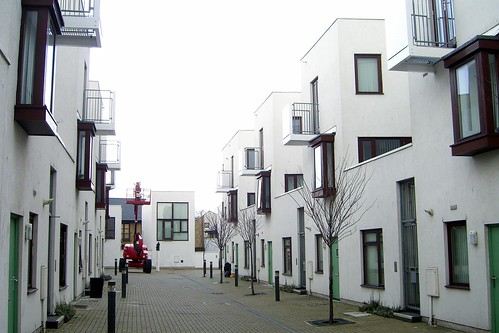
Front windows are on the pavement, and aside from some sparse planting strips there is no transition at the building facades, in contrast to many traditional terrace house typologies in England (though Victorian terraces are often built right at the street edge) or townhouses in US cities like New York where there is usualy a stoop or small front garden. This lack of transition in front of the houses means that people have done little to personalise them as the public zone starts at your front door. The private space provided on the small balconies  play into Barber’s frequent quoting of Walter Benjamin and his ideas about using building as a stage, but I would be surprised if they are ever actually animated by human activity as they are extremely small and exposed. The shops at the main street edge are a welcome feature and they help to give more personality to scheme as a whole through their signage and window displays.
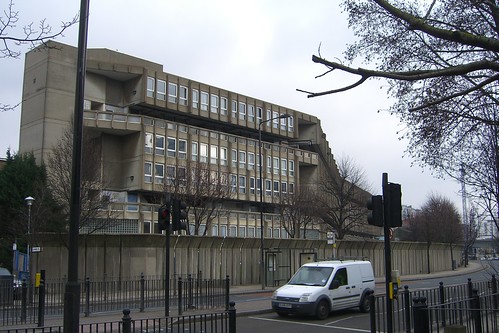
Density at Robin Hood Gardens is created by concentrating the housing units in two residential blocks, which flank a large central green space to shelter it from the surrounding traffic. The site is essentially a large traffic island, with the Blackwall Tunnel approach on one side and a multi-lane road with buses on the other (Google Map). Open space was required in the program given to the the Smithsons, and their solution was a very effective way to achieve it while still maintaining a high enough unit count to meet the design brief. The original program also called for maximum sound levels of 50 DBA during the day and and 35 DBA at night, which resulted in a street edge that looks like this:
Another element called for in the brief was parking, which is located in a “moat” behind the concrete sound wall and beneath the building:
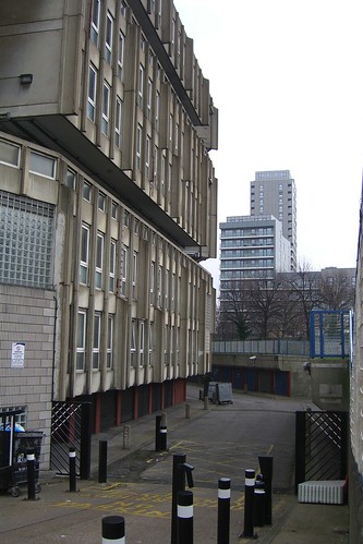
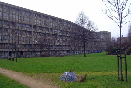
A solution that put the parking entirely under the buildings would have been preferable, as the current layout makes it difficult to approach the building from the sidewalk. Visitors need to walk to one end or the other to cross the sunken parking area and then walk around the blocks to reach the open space at the centre of the site. The central garden is enormous, and welcome considering the amount of traffic the surrounding area. A massive flock of birds took to the air as I approached the constructed hill at its centre- I can’t stress what an impression this makes when you walk into the garden from the south. The hill and trees planted on it create a third edge for the courtyard and make it feel secluded from the surrounding city. The site would be improved by incorporating more programmed space in the courtyard like a picnic area, better play areas, and allotment gardens for residents, as it doesn’t seem to be very heavily used at present.
Looking back to Donnybrook Quarter, I was expecting to be blown away by its pristine whiteness based, as most of the published photos of the project seem to emphasize this contrast with the surrounding brick construction. In reality, after a four years of exposure to East London air quality and visits by neighbourhood taggers, a bit of the shine has worn off.
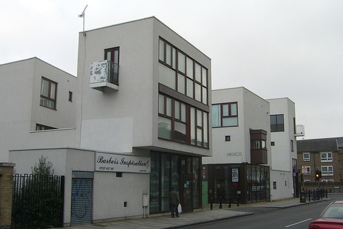
Most of the paint has peeled off the steel balcony rails, and some of the render has been painted over and/or damaged, resulting in a uneven surface finish. When I saw this project published a few years ago, I questioned how a white render exterior finish would survive at street level in London. The answer? Not well. The colour is attributed to a desire for light to reach deep into tight corners in Ellis Woodman’s review of the project in Building Design, but I think it’s a purely stylistic choice for Peter Barber, as it is a frequently recurring theme is his work and he speaks of the influence of Alvaro Siza in shaping his design sensibilities. While this colour scheme and material choice may work well on a Portuguese hillside, it is inappropriate for a high-traffic site in the middle of East London.
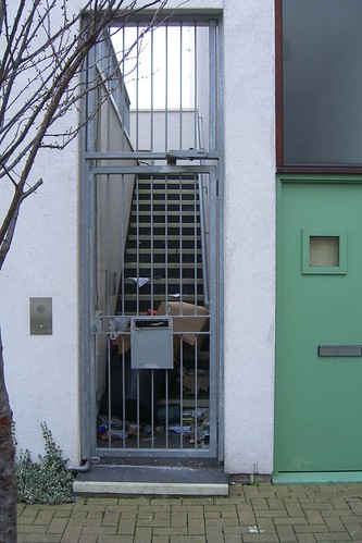
Many of the most frequent criticisms of Robin Hood Gardens involve issues of maintenance that are out of the realm of the architect’s responsibility, and the Tower Hamlets council has been accused of avoiding work on the building to encourage residents to move out. Upon visiting the site, the building itself doesn’t look  bad considering the obvious lack of care it has received over the years. While some people may not appreciate concrete, it is certainly more durable and retains most of its original appearance more than thirty years on. Many of the painted bits obviously need care, and the interior public spaces have always been problematic (see Nicolai Ossolouf’s piece in the NY Times for more on this) but overall the complex has not aged poorly, all things being considered. It is easy for people to point at trash or graffiti and claim that it was somehow the fault of the architecture, but this is usually symptomatic of social and economic issues not design choices. In fact, it even happens at celebrated and progressive new mixed-tenure developments:
Both projects approach housing design from a very different standpoint, both theoretically and materially. With proper maintenance and upgrades, Robin Hood Gardens could be made viable for generations to come. The density could be increased without compromising the original design (or tearing it down completely) through careful architectural intervention. Donnybrook Quarter has some obvious shortcomings, but overall it is a welcome change from most of the other housing that has gone up in the area. Peter Barber has created a new typology that still needs some fine-tuning, but is otherwise a smart update to the traditional terrace house.  I think each of these projects could have stood to incorporate pieces of the other within their designs- a smaller garden with more intimate spaces would have helped at Robin Hood Gardens and more durable materials and some permeable landscaping would have been nice to see at Donnybrook.